
A “404 page not found” is the digital equivalent of hitting a dead-end, but it doesn’t have to be a bad experience. Instead of leaving users frustrated, your 404 page can be an opportunity to engage them in a creative way.
Often, 404 pages are simply overlooked, and users face a sudden stop without any guidance. However, with a custom 404 page design, you can make the most out of this moment, turning it into a positive interaction that keeps users on your site.
Curious about how to improve your 404 page? Check out some innovative 404 page ideas from leading brands like Wix Studio, Airbnb and Lego. But first, let’s quickly explore what a 404 page is and why its design matters.
So, What is a 404 page?
A 404 page appears when a user tries to access a page that no longer exists or can’t be found. Essentially, it’s an error message sent by the server when the requested page is missing. This can happen for a few reasons:
- The content may have been removed from the site, but the old link still appears in search results.
- A link might be broken due to a typo or an outdated URL.
- Sometimes, the user may have typed the URL incorrectly.

To prevent confusion, it’s important to keep URLs clear and simple or offer tools like a QR code to help users find what they’re looking for quickly. This is also a good opportunity to think about your custom 404 page design and how it can redirect users back to valuable content.
Top Tips for Creating Effective 404 Pages
A 404 page is often the first sign that something went wrong on a website, but it doesn’t have to be a dead end for your users. With the right design, a 404 page can be transformed from a frustrating experience into an opportunity to engage visitors and guide them back to useful content. Whether it’s through humour, creativity, or smart navigation, a well-designed 404 page can leave a lasting impression and help maintain a positive user experience. In this guide, we’ll share top tips for creating an effective 404 page that not only addresses the error but also keeps your audience engaged and on track:
1. Stick to Minimalist Design Principles
The main goal of a 404 page is to clearly guide users on what to do next when they land on an error page. A complex design can confuse and distract visitors. To avoid this, keep the design simple and focused, reducing unnecessary details. For example, Dropbox’s custom 404 page uses a clean, minimalist design with a helpful message and clear links to the homepage and other useful areas of the site.
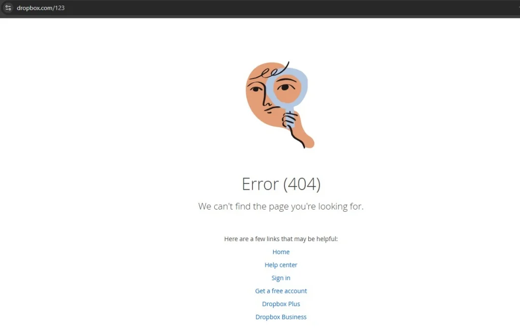
This ensures users can quickly get back on track without feeling frustrated. A thoughtful 404 page design helps maintain a positive user experience, even when something goes wrong.
2. Clearly Explain What Went Wrong
The worst thing you can do with a 404 page is to leave users without any explanation. Instead of just displaying an error message, turn the situation into an opportunity to guide them. According to Jakob Nielsen’s guidelines, website designs should help users understand the issue and offer a way to recover from it.
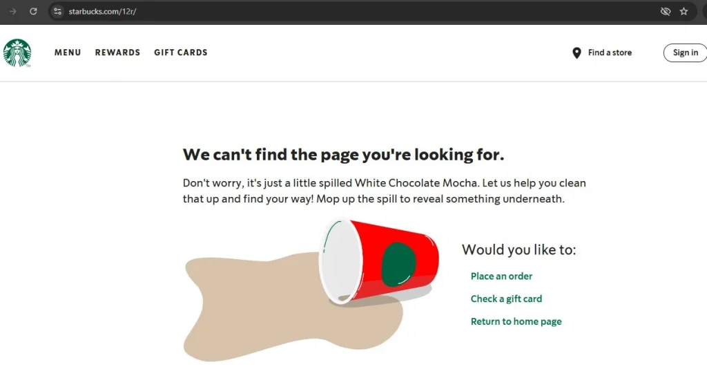
For example: Starbucks has a special 404 page that appears when a page can’t be found. It gives a simple, friendly message to explain what happened. It also offers easy choices to go back to the homepage or look at their menu. This helps users understand the mistake and find what they need. Using simple words instead of hard technical terms makes it easier for everyone to understand, especially people new to English or technology.
3. Keep The Content Simple And Concise
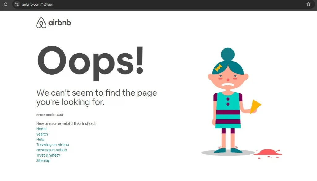
On the web, people tend to scan content rather than read it fully, so it’s important to keep things brief on a 404 page. Avoid long blocks of text, and instead focus on making every word count. A great 404 page design should quickly convey the message and offer a simple way to move forward. For example, the 404 page on Airbnb uses minimal text with a clear, simple message and a prominent call-to-action button that directs users back to the homepage. This approach keeps the experience straightforward, helping users get back on track with minimal hassle.
4. Add a touch of humour
Laughter can help lighten the mood, so consider adding a bit of humour to your 404 page. Errors can be frustrating, but a well-timed joke or light-hearted comment can ease the frustration and create a more enjoyable experience.
It’s important to know who you’re talking to. Make sure the jokes match your brand’s style and personality. A funny pun can make people smile, but a bad joke might not work, especially if they need help or want a serious experience.
Be careful not to use jokes that might upset or exclude people. Everyone has different ideas of what’s funny. It’s best to avoid jokes about culture, identity, or values that could hurt someone’s feelings.
A key tip: Write simple and clear text for your 404 page. You don’t need fancy pictures—good writing and helpful links are enough. Make sure your words match your brand’s style and speak to your audience. Use short sentences and easy words. Avoid being too formal. Active voice makes your message more engaging, but you can use passive voice to explain technical problems.
5. Put thought into the copy
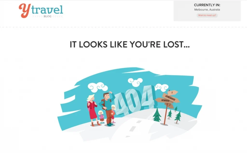
A 404 page is a great opportunity to infuse some personality into your site. Rather than a dull message like “404: Page Not Found,” consider using a more casual, friendly tone, like “Whoops! This page seems to have vanished.” For example, a popular travel website might use, “404. It seems this page has gone off track!” and pair it with a fun map graphic.
Using creativity and some humour can make an error page less annoying. It also helps create a good experience that matches your brand’s personality.
6. Use Relevant Visuals
A good 404 page can keep visitors from feeling frustrated, even if it’s their first time on your site. Simple pictures and creative text can show off your brand and help fix the problem.
If you’re unsure about what kind of visuals to use or want to avoid a page that feels too out of place, a simple design with straightforward text and useful links can still work wonders. For example, a clean page with a helpful message and a button leading back to the homepage or popular sections ensures users can quickly get back on track, while still reflecting your brand’s professionalism.
7. Direct Users to Your Best Content
While many see a 404 error as a dead-end, it can actually be an opportunity to introduce users to more of your site. Instead of letting them leave, offer a selection of helpful links to your best content, encouraging them to explore further. Without these links, users are less likely to keep browsing.
Not sure which links to include? A good idea is to check the URL for any typos and suggest similar pages that might match what the user was looking for. For example, if someone types in a misspelt URL, you can display a list of related pages, guiding them toward useful content and keeping them engaged.
8. Make The Call-to-Action Stand Out
A 404 page can make your website better for visitors. Use a fun picture, explain the error clearly, and add a big button to help people find their way. This can turn frustration into something good.
While the design of your error page is important, the functionality is what truly matters. If you’re unsure what links to offer, focus on providing a simple solution: a clear CTA that takes users back to the homepage. For example, a straightforward “Go Back Home” button can help users easily navigate away from the error page and keep them engaged with your website.
9. Include a Search Function
Good user experience (UX) is all about anticipating what users need and making their journey as smooth as possible. When users land on your 404 page, give them a search option so they can try to find what they were looking for. This not only helps them get back on track but might also encourage them to explore parts of your site they hadn’t planned on visiting.
Pro Tip: Allow users to report errors, but make it optional. This way, they can help you improve the site without feeling pressured. For example, Spotify offers users the chance to search for what they need on the 404 page, while keeping the process simple and welcoming.
10. Stay True to Your Brand Identity
A 404 page might seem like an outlier, but it should still align with your website’s overall look and feel. When done right, it can actually help improve usability and boost conversions. Make sure that any illustrations on the page match your brand, the language reflects your tone, and the font and colours stay consistent with the rest of your site.
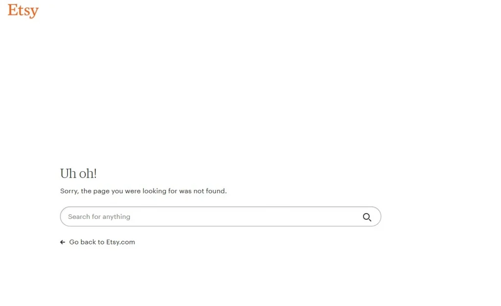
Even if the 404 page functions properly, it can feel disconnected from your brand if it doesn’t match the design of the rest of your site. This could be a missed chance to keep users engaged and guide them back to exploring your product. For example, Etsy ensures that their 404 page has a similar design and tone to the rest of the site, making it feel like a seamless part of the user experience.
11. Avoid Unnecessary Clutter
Simplicity is key when designing a 404 page. While it can be tricky, keeping things simple can save users from frustration and confusion. If you’re unsure about what to include, a brief apology and a search bar can go a long way in helping users get back on track.
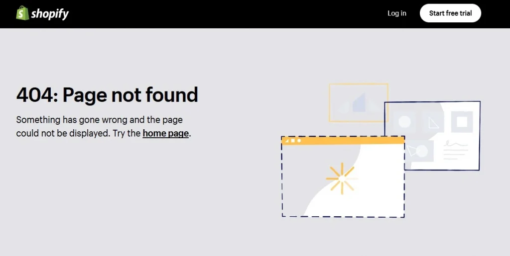
It’s important not to leave users stranded without an option to move forward, but bombarding them with too many links is just as unhelpful. Following the idea of minimalistic design, unnecessary information can clutter the page and confuse users. As a general rule, less is more. For instance, Shopify keeps their 404 page clean and simple with a short apology, a helpful search bar, and a clear button to return to the homepage, ensuring a seamless experience for users.
12. Don’t Overdo It
A basic, unremarkable 404 page often leaves users feeling disappointed and abandoned. However, adding a mismatched illustration or an awkward joke can make things even worse. The key is moderation—this applies to error pages too. Overloading your page with too much information can overwhelm users and increase their cognitive load. Keep it simple and focused to make sure the page serves its purpose without causing frustration. For instance, Twitter uses a straightforward design for its 404 page, with minimal text and an easy path back to the home page, ensuring a seamless user experience.
13. Include Interactive Elements
We all have a playful side that enjoys a bit of fun when we’re bored, so why not use your 404 page to entertain users and keep them engaged?
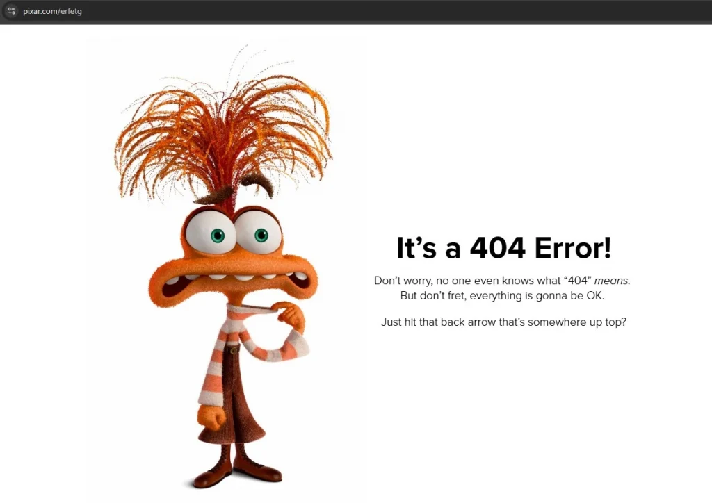
An excellent example of this is Pixar’s creative 404 page. It features a random selection of fun, animated characters and playful messages, making it a delightful distraction. The page also includes a search bar, turning it into an interactive experience that encourages users to explore more of the site. By adding this extra layer of engagement, the 404 page becomes more than just an error—it becomes an enjoyable part of the website.
Key Elements of an Effective 404 Page
So, what should your 404 page include? While your 404 page design should follow the best practices of responsive web design, there are a few key elements that stand out:
- Consistent navigation and branding: Your 404 page should align with the rest of your website in terms of design. Use your logo, brand colors, and ensure the page includes the same top navigation and footer as the rest of your site.
- Accessibility: Just like the rest of your website, the page must follow accessibility best practices, ensuring it’s usable by everyone, including those with disabilities.
- Clear error message: While creativity is welcome, it’s essential that the error message is immediately visible and unmistakably states that it’s a 404 error page.
- Suggested actions: Since this isn’t the page users intended to visit, it’s important to guide them back to the right place it effects your SEO too. Offer at least one actionable option, like a link to the homepage or a search bar to help them find what they’re looking for.
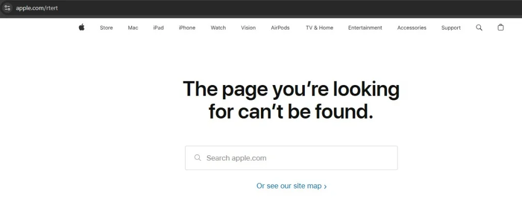
For example, Apple uses a simple, clear message along with a “Go back to Home” link, helping users quickly navigate their way around the site.
The Advantages of Designing a Custom 404 Page
While we can hope for a world without web development errors, every web design should include a well-thought-out 404 page. This is your chance to create something unique and turn a frustrating moment into a positive experience. Here are a few reasons why customising your 404 page is worth it:
- Improved user experience: A good page doesn’t leave visitors stranded—it helps them find their way. For example, offering links to popular pages can help guide them to content that interests them.
- Visual appeal: A well-designed 404 page can make a lasting impression. Studies show that users are more forgiving of small usability issues when the page is visually attractive.
- Marketing opportunities: A creative 404 page can reinforce your brand and enhance its image. A thoughtfully designed error page can guide users to take the right next step, potentially turning a frustrating experience into a conversion opportunity.
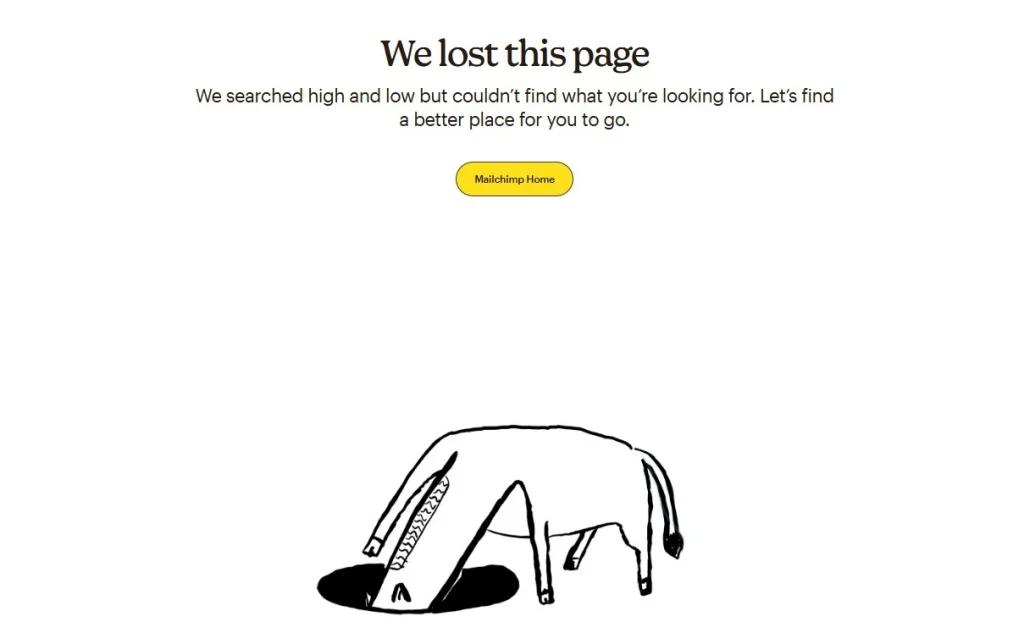
For example, Mailchimp uses a playful and on-brand 404 page, featuring helpful links and a touch of humor, which reinforces the brand’s personality and keeps users engaged.
To Conclude
Making a good 404 page is about turning a problem into a chance to connect with visitors. A fun and helpful 404 page should show your brand’s style, help people find useful content, and make it feel less like a mistake. Use clear words, simple navigation, and nice visuals to keep users happy. This helps keep visitors on your site for longer. Whether it’s a funny design or a simple one, make sure it fits your website’s look and goals.
A smartly designed 404 page can make visitors happier, boost sales, and make your brand look better. Don’t forget about this small part of your site—it can have a big impact.